Staysure launches the first-ever ChromaTravel Index – a data-driven approach to ranking global destinations by colour. Chefchaouen, Morocco, is officially crowned the most colourful destination in the world, with three UK locations making the global top 25 – Tobermory, Portmeirion and Brighton.
New research by Staysure, the UK’s leading travel insurance provider*, has officially named the most colourful travel destinations in the world in a first-of-its-kind study.
The study uses a data-driven ‘ChromaTravel Index’ to scientifically rank 26 global destinations based on colour saturation, vibrancy, and hue variation.
Each destination was assessed using 15 unbiased, daylight-only images, gathered from a range of public sources including Instagram, TripAdvisor, and Google Street View. The factors were combined to create a single ‘ChromaTravel Index’ score out of 100. The result – a definitive ranking of the world’s most vibrant travel spots.
La Boca, Argentina
Inspired by an increased interest in customers travelling to vibrant and colourful destinations for their mood-enhancing and wellness benefits, coined ChromaTravel, Staysure’s data team set out to measure colour in travel photography objectively.
Topping the list is Chefchaouen, the iconic “Blue City” of Morocco, followed closely by Nyhavn in Copenhagen, Denmark and Bo-Kaap in Cape Town, South Africa. Beloved favourites like Burano in Italy, often considered the most colourful town in the world, also made the top five.
UK destinations, including Tobermory (Scotland), Portmeirion (Wales), and Brighton (England), also entered the global top 25, making colourful escapes closer to home more appealing than ever.
Portmeirion, Wales
The research was supported by leading colour psychology expert Karen Haller, a global authority in the field of applied colour psychology, with over 20 years of experience in how colour influences behaviour and wellbeing. She comments on the findings:
“There’s something about stepping into a place full of colour that instantly lifts you. It changes how you feel, how you move through the space, and even how you connect with others. That’s why colour-filled destinations are becoming more popular.
We’re drawn to them not just because they look good, but because they leave us feeling better. Happier. More open. More alive. It’s something I do myself, seeking out places where colour isn’t just seen, it’s felt. And those are the experiences that stay with you.”
The Official Top 5 Most Colourful Places in the World
Karen Haller examines the destinations and shares her insights into the colour psychology of each.
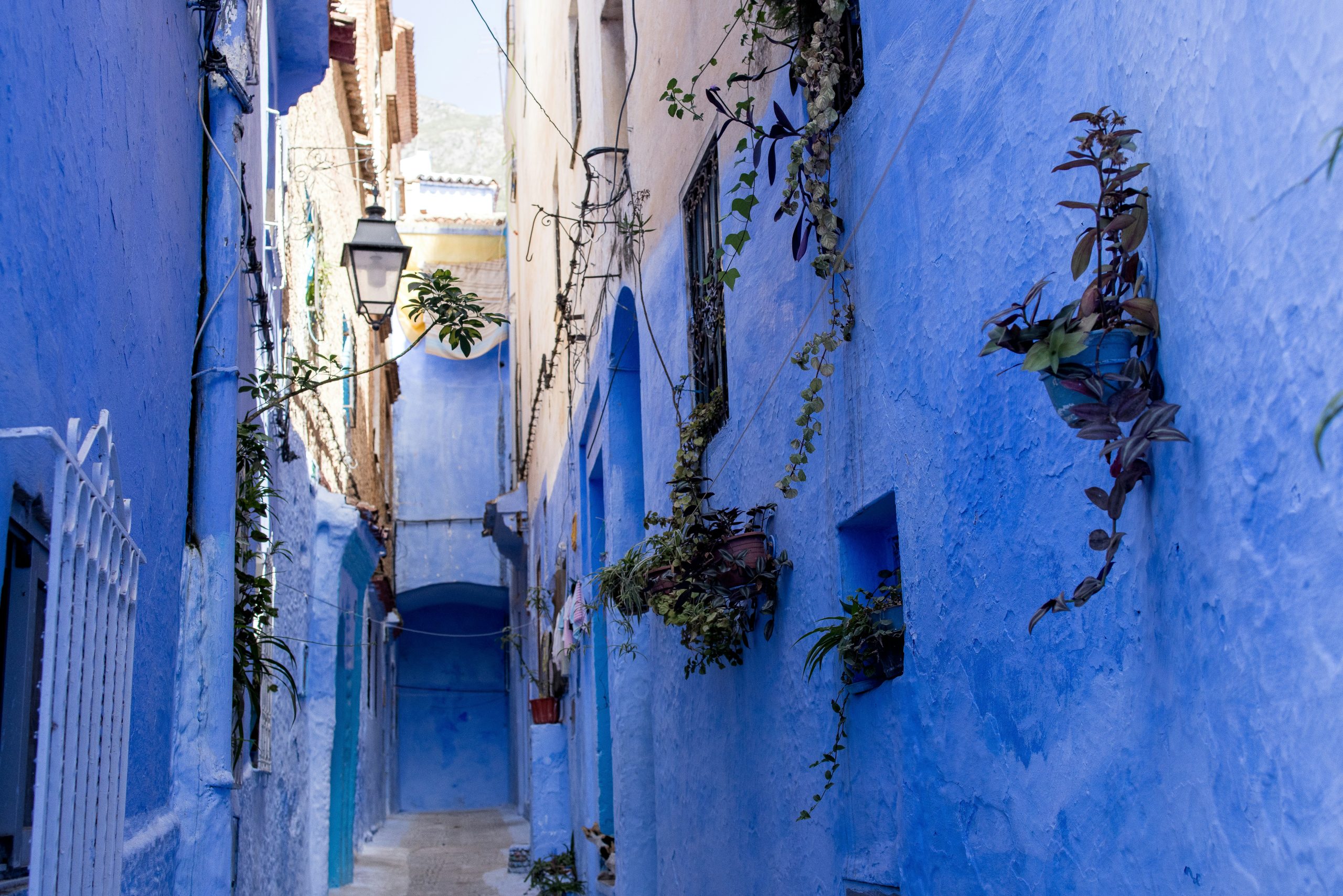
1. Chefchaouen, Morocco
ChromaTravel Index Score: 73/100
Dominant Colour: Blue
“Chefchaouen, nicknamed the ‘Blue City’, is famous for its light blue, sky-coloured streets and buildings that seem to wrap the town in calm. The soft, consistent use of blue creates a peaceful atmosphere that many visitors find instantly mentally soothing.
In colour psychology, light blue is known to promote relaxation and a sense of quiet, which may explain why wandering these blue-washed lanes can feel almost meditative.”
2. Nyhavn, Copenhagen, Denmark
ChromaTravel Index Score: 72/100
Dominant Colours: Bright yellows, reds, blues
“Nyhavn, Copenhagen’s famous harbour district, is instantly recognisable for its row of brightly painted waterfront houses. Their bold, cheerful colours bring a sense of warmth and joy that can lift your spirits, especially in the darker months. In colour psychology, saturated hues like these can help energise and uplift.
On a more personal level, the playful palette may stir nostalgia, evoking childhood memories or the charm of a storybook scene. It is no surprise that Nyhavn remains one of the city’s most beloved and photographed spots.”
3. Bo-Kaap, Cape Town, South Africa
ChromaTravel Index Score: 72/100
Dominant Colours: Bold pinks, greens, blues, and yellows
“Bo-Kaap’s vividly painted houses create an atmosphere bursting with energy and joy. The mix of bold colours like orange, pink, turquoise, yellow, and lime green makes the neighbourhood feel alive and full of personality. In colour psychology, vibrant hues can help stimulate and energise the senses.
While the emotional response is personal, such a rich and playful palette can spark feelings of joy and happiness and may even encourage a sense of social openness. It is no surprise that visitors often find themselves smiling, lingering, and taking it all in.”
4. Balat, Istanbul, Turkey
ChromaTravel Index Score: 70/100
Dominant Colours: Rich reds, blues, and yellows
“Balat’s softly faded colours create a gentle, nostalgic atmosphere that invites you to slow down and take in the details. The palette of muted yellows, greens, and rose colours gives the neighbourhood a sense of quiet charm, while brighter hues like turquoise and orange add occasional bursts of energy. In colour psychology, softer colours like these can have a calming effect, helping to reduce visual noise and create a sense of ease.”
5. Burano, Venetian Lagoon, Italy
ChromaTravel Index Score: 70/100
Dominant Colours: Bright rainbow spectrum – pinks, greens, oranges, blues
“Burano, a small island in the Venetian Lagoon, is world-famous for its rows of brightly painted houses that line the canals like a patchwork of colour. From vibrant pinks and reds to sunny yellows and bright turquoise, every home adds to a street scene bursting with personality.
Local legend says the colours were originally chosen so fishermen could spot their houses from the water through the fog.”
For the full ChromaTravel guide, visit Staysure’s website
*Based on winning ‘Best Travel Insurance Provider’ for eight consecutive years (2016-2024) at The British Travel Awards and more 5-star reviews on Trustpilot than any other UK travel insurance company.